About Me

My photo
I'm Sian Pryce, a student at Wolverhampton Unversity, studying Graphic Communication.

Tuesday 13 December 2011

'My Space'... Creating the final piece.

I think this is where my final idea is starting to come together. I really liked this idea and developed it in lots of different ways until I settled with one.
I had to create 2 a3 potential final designs using photoshop. Both were created from sketches in the folder. I did choose 2 completly different ones but I like the top one better than I like the bottom one. I think the composition of the top one is alot stronger however, still alot of room for improvement.
I've gone on the design few more ideas to try and improve my favourite design from the previous page. With feedback from my tutors aswell as my own thoughts I came up with a few different ways I could improve my poster.
I created some of my new improved designs on photoshop. Only with little bits that I changed, so you might not be able to see but the bottom one is eventually where I wanted to get to and I'm happy with my final design.

 
This is my final poster, printed as a3 on luster paper. I'm so happy with the way it has turned out. I think making everything come out of the wheel instead of just using it to frame the photo works brilliantly! The way the the ivy is coming out then goes back in leads you to the dog where he comes back out of the wheel, then you're lead back in and out again with the tree! It really leads your eys across the page.

'My Space' Designs.


As you can see I've used a range of different types of artists which I put together and used different elements and ideas from each one to create something new and interesting! I feel alot more confident on the project already rather than the last one. I'm confortable with the process, comfortable with the rough sketches, and getting more comfortable with the fast pace of working. I really pleased with my range of ideas so far.

'Zine' Designs... Finals and mounted!


As you can see I've improved my designs again since the last time I worked on the computer, using feedback I recieved from different people. I am really pleased with the way they have turned out and I think this project has really widened my knowledge about Indesign.

'Zine' Designs... Working on the computer.

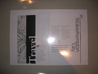
I'd never used Indesign before this, and with the help from Jeff I created the top design for my DPS. I can still work on it to improve it but for a first attempt I was very pease with the way it turned out!
The second design I did on the computer was the Hello and Welcome one. As a first design I think it worked well, however, the photo I used turned out pixelated so I definetly need to change that. There is still room for improvement though.

Working on the computer still, I've tried to improve my DPS about travel. I recieved some good feedback about these from Jess and peers and feedback in ways I could slightly improve these again for my final. I think hese designs are definelty getting there though and I am starting to enjoy and feel more comfortable using Indesign.

'Zine' Ideas

 
 These are a few more designs for my Zine DPS and the introductionto the 2nd brief with a few designs. I'm starting to feel more comfortable with my rough sketches and estimating the right amount of text.

More designs for the 2nd breif - the Hello and Welcome DPS. I definetly feel alot more confident with designing on a smaller scale now too. I am finding it alot easier.
Working on the final part of the 2nd brief - The front cover. I think this was probably the easiest task to do because theres not as much to think about with allignments of text, this is why I left it until last. I was also trying to make sure that the Hello and Welcome DPS and the front cover looked like the belonged to the same magazine, so I tried to add element which would pair the 2 designs!

Friday 11 November 2011

'Breathless' Film Review


This black and white, French, subtitled film is certainly not a film I would usually pick to watch. With its low budgets and hand held cameras I would have never of thought Breathless would have became such a success.
Michel and Patricia are the 2 main actors. Michel has killed a policeman and is now on the run. He’s come to France to find his American friend Patricia – who has a respectable job as a journalist and tries his luck in asking her to go to Italy with him. However, once Patricia finds out about his antics through a newspaper article, she hands him into the police.
I think something a lot of reviews I’ve read have overlooked, but a subject that became quite apparent too me is how Michel treated Patricia. I think he was quite disrespectful towards women calling them ‘scumbags’ and ‘dogs’. The 1960’s were the years of a revolutionary change where women were starting to be looked at in equality to men. They were able to stand up for themselves and I think this really reflected in the film when she slaps him and doesn’t give in to his sex demands. Michel’s attitude towards people in general was also quite unacceptable really, as he spent most of the film robbing people of their money, stealing cars and then going to sell them afterwards to make money. So somehow or another money was always on the mind for this bloke.


The quality of the acting in my opinion was very poor, it was very clumsy and because of this, it came across as a bit humorous. They over reacted a lot of things, one of the examples being the exaggerated death of Michel at the end. Scenes that we would usually take quite seriously in up to date films, me and most of the other people in the room found ourselves giggling at.
I think the overall look of the film, being in black and white, as we don’t very often see new films like this; it gave it a very classy look and feel and made France look very beautiful. Patricia was a gorgeous young woman and represented young females in a positive way with her strong character.
At the end of the day, Jean-Luc Godard probably didn’t think this film would be a great success and who would blame him when there was such a low budget and not very convincing actors…But it did become a hit and it made me laugh! So Well Done!

Thursday 20 October 2011

'Zine' Ideas

I chose what fonts I wanted to use and drew them out. I chose a serif font and a sans serif font. Garamond and Helvetica.

These are a few of my designs for the 'Zine' I will eventually develop them on the computer. I think my favourite designs are the bottom 2, I've added a stip of a map, and I think this links to me subject well as I'm talking about Travel in Wolverhampton City.

This is another page of my designs for the 'Zine' I really like the 2 left hand ones. The top one is kind of reflective with both parts of the title on they're side. I was also trying to represent roads as my subject is travel. The bottome left hand design, I think i could play around with positioning of text.

Finished trading card design

Finished trading card design using; Photoshop, Indesign and Illustrator. I feel I definitely need to widen my knowledge on Illustrator and Indesign.

'My Space' first brainstorm

This is my first brainstorm for the second Understanding Imagery project. I've thought about my favourite places and things to do now, aswell as memories from when I was younger.